MetLife
Usability testing on native — refining MetLife's redesigned Android and iOS apps for millions of customers.
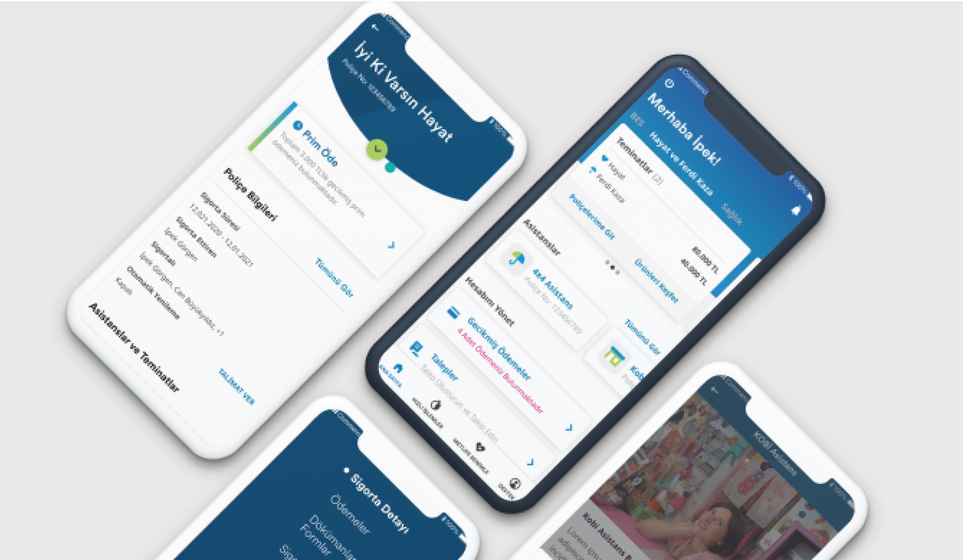
Key contributions: planning, facilitating, and driving outcomes.
MetLife, a global insurance company, was building a digital platform to help millions of customers in Turkey manage policies and pensions. I led usability testing and design improvements to ensure the platform was clear, scalable, and customer-friendly. This project required consolidating 70+ features into one cohesive experience while balancing customer needs with business requirements.
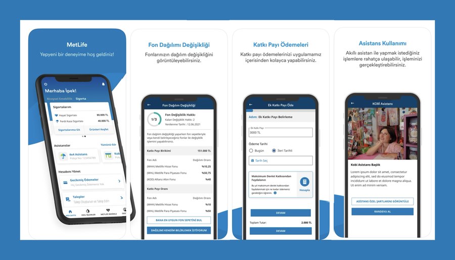
During the usability evaluation of MetLife's redesigned Android and iOS apps, the goal was to uncover which design elements supported users effectively, and which created friction. Key questions included:
- Which features were intuitive and easy to navigate?
- Where did users struggle to locate or complete critical tasks (e.g., payments, policy details)?
- How clear was the terminology, particularly around features like "Assistant" vs. "Assistant+"?
- Did the structure scale effectively across 70+ insurance features without overwhelming users?
These insights directly informed subsequent design decisions — prioritizing clearer navigation, refining terminology, and improving the discoverability of high-value features.
- Considering the general evaluation, it was determined that the studied flows are generally usable.
Discovery
Defined user tasks, personas, and success criteria.
Testing
Moderated 10+ usability sessions, created test scenarios, and tracked performance.
Iteration
Analyzed Maze data and survey results, refined flows based on insights.
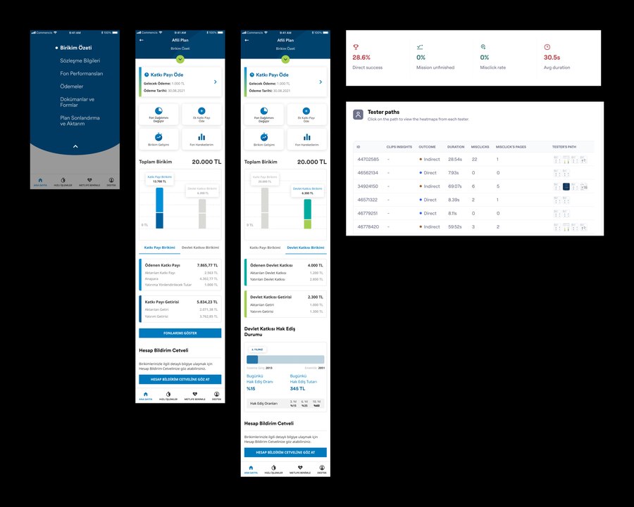
I ran the study with 10+ end users.
Pilot testing
I conducted three internal pilot sessions to validate the testing method, timing, and flow. These helped refine materials and ensure smooth facilitation before launching the full study.
Execution
Moderated 10+ usability tests with end users, observing behaviors, pain points, and workarounds across both Android and iOS apps.
Analysis & synthesis
Collected both qualitative and quantitative data, grouping findings into themes and assigning severity ratings. I identified friction points in critical user journeys, as well as opportunities to strengthen clarity and consistency.
Reporting & impact
Partnered with stakeholders to prioritize issues using feasibility, viability, and desirability criteria. Produced a comprehensive usability report that guided design refinements and influenced the next iteration of MetLife's digital platform.
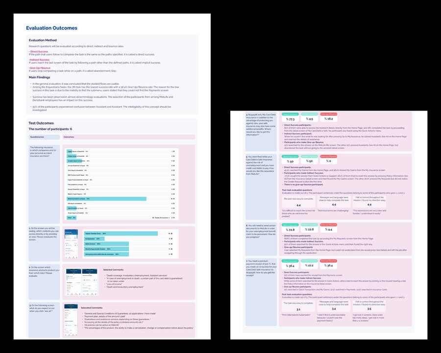
I got lost in screens — there were too many steps, I get lost in more than one or two screens.Participant feedback — Task 7, payment receipt
Overall usability
Most flows tested were found to be generally usable, confirming the strength of the redesign in supporting key tasks.
Critical pain point
Task 7 revealed a 36.4% give-up/bounce rate, with users struggling to locate the Payments screen buried in the submenu. This insight highlighted the need for clearer navigation and prioritization of high-frequency tasks.
Terminology success
Participants showed strong comprehension of general terminology, likely influenced by prior familiarity as MetLife and Denizbank employees.
Terminology gap
However, 50% of participants confused "Assistant" with "Assistants," pointing to a critical need for simplification and clearer distinction in naming. This became a key recommendation for future iterations.
Shipped
These findings directly shaped the final release. The consolidated navigation and simplified terminology went live as part of MetLife Turkey's first mobile insurance platform launch — the redesign this testing was built to validate.