
Redesigning Card Management at Scale
Five business units each owned a piece of İşCep's card experience — debit, credit, prepaid, digital. I brought them into one dashboard, inside Turkey's most-used banking app. The hard part wasn't the interface; it was the alignment.
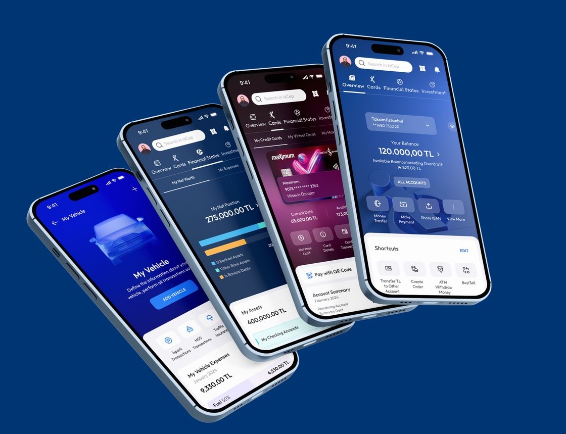
Key contributions: leading MVP design, facilitating discovery workshops, research, and usability testing.
Alignment doesn't come from consensus alone — it comes from making trade-offs visible and grounding decisions in user evidence.The core lesson from working across five business units
Currencies sat under one physical card in a horizontal scroll, so people read each currency as a separate card — extra confusion and cognitive load just to check a balance.
One tabbed structure holds every card type. People switch between credit, debit, and digital cards, then pick a specific card from a dropdown — all on a single summary page.
- Cut the confusion from fragmented card views
- Lower the cognitive load of juggling multiple card types and currencies
- Bring every card into one clear structure
- Make card management faster and more intuitive
- We started from customer feedback, mapping where the existing card experience broke down.
- I benchmarked user needs against comparable products to set the redesign direction.
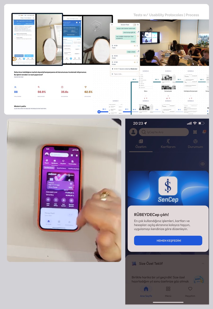
- Testing the existing experience exposed the scale of the problem — a 56.9% misclick rate, 62.5% task success, and 35.6s average task time. Clear evidence people were struggling to find and manage their cards.
- I iterated the new structure, then we validated it: moderated testing with 12 users and unmoderated with 88 (~100 total).
- I refined from the findings, focused on debt-payment visibility and card selection via dropdown.
- I led the design; we shipped it with product, engineering, BAs, and QA.
- Dashboard-first navigation took hold — people reached card features straight from the dashboard instead of digging through the menu (1.6× more via the dashboard than the old path: 14.5% vs 9.2%).
- Fewer steps — card tasks got done with less reliance on deep menu paths.
- Clearer card management — behavioral data showed people switching between credit, debit, and digital cards more easily.
Single dashboard
Card types are one tap from the dashboard, with the menu kept in place to support existing habits.
Unified currency
Instead of a separate card per currency, all currencies fold into one card summary — from the dashboard or via tabs.
Pay multiple cards
Pay the debt on several cards in one flow, instead of a separate journey per card.
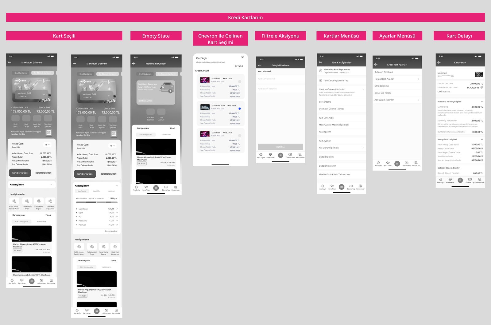
Beyond the core dashboard, the redesign extended to the surrounding system: card selection, empty states, filtering, and settings.
Establish a shared mental model early
Designing across multiple card business units requires establishing a shared mental model early to keep teams aligned.
Clear principles matter more with more stakeholders
Working with five different business units highlighted the importance of clear principles to guide decisions when priorities conflicted.
Alignment comes from visible trade-offs, not consensus
Alignment doesn't come from consensus alone — it comes from making trade-offs visible and grounding decisions in user evidence.
Ownership and documentation preserve consistency
Clear ownership and documentation helped maintain consistency across interconnected card experiences.